Role
Producer, Editor, Designer
Size
One-man band
Client
Anyone who has struggled with the carousel.
Disclaimer: I don't work for Spotify.

Carousel Case Study (feat. Spotify & Service NSW)
What is the best way to use Carousel and what to consider before you actually using it
Context
Good old "Hold to preview"
Spotify used to feature a preview function, allowing users to press and hold a song to hear a short sample. I found this feature incredibly handy for quickly discovering new music without clicking into full display pages back and forth. I was fully on board with that feature and used it frequently, but then it got removed. I think we have all experienced this type of feeling, you just getting used to a feature or function then it is removed for some reason, disrupting the established flows or habit.
New "For your taste" feature
With the development of AI, the music discovery experience came back and went above and beyond with the aid of a recommendation algorithm. It now proactively feeds new songs that suit your taste, eliminating the need to go through albums and albums by yourself. While I still enjoy the manual way of searching for songs, it’s really rewarding when you finally find your poison.
But in this case study, we’re not discussing whether AI limits creativity and people's ability to explore. Instead, I’ll focus on some usability issues I’ve found as both a user and a designer.
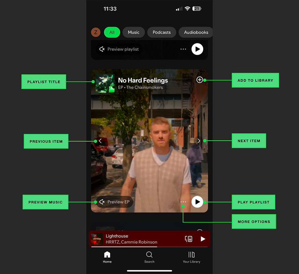
The music recommendation card - Why use a carousel here?
Carousels are a popular design choice for fitting more content within limited-screen real estate. However, they come with significant trade-offs:
Pros:
-
Efficiently showcases multiple items in a compact space.
-
Engages users by offering dynamic, visually appealing content without overwhelming the interface, especially for entertainment rich or e-commerce products.
Cons:
-
Discoverability: Users tend to focus on the first item and rarely scroll through to the end. Prioritising content effectively becomes crucial.
-
Accessibility: Carousels are challenging to design for accessibility, with numerous potential pitfalls that can hinder usability.
Bad visibility and accessibility
Putting button controls on image content especially videos could create unpredictable contrast issues.
Carousels with arrows sitting atop dynamic video content pose a significant visibility issue. Even with a contrast ratio meeting WCAG’s minimum of 3:1, the ever-changing video backgrounds can make interactive elements hard to notice and use. Adding an overlay behind the arrows helps but doesn’t fully resolve the problem. Enhancing the background colour or adding a solid white button design, like Spotify’s play button, can improve visibility but risks distracting users from an immersive, full-screen experience.
Material Design also suggests avoiding UI elements within or beside the carousel itself to prevent unpredictable contrast issues.
Potential issues with the Spotify design
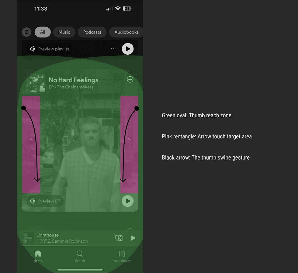
Not Gesture-Friendly: Mis-Touch Problems
The button design should accommodate gesture-based navigation. Avoid placing interactive elements near screen edges, as they often conflict with common mobile gestures like scrolling and returning to previous screens.
According to WCAG AAA, the minimum touch target is 44x44 CSS pixels. It’s great that the team made the touch area larger (highlighted in pink), as the entire column is now a functional touch area, which improves accessibility. However, those touch areas inadvertently interfere with the vertical scrolling experience in some way (as indicated by the black arrow, which represents my thumb swipe motion).
Thanks to the UX community, it’s not just my observation—similar tests have been conducted, and this behaviour has already been validated. According to Samantha Ingram (2016), users often swipe from the edge of the device toward the centre when scrolling up or down. This happens to overlap with the area users interact with when engaging with the arrows.
This overlap makes the arrow controls risky to use. While individual scrolling preferences may vary, small design details like this, even if they seem minor, can potentially harm the overall user experience.

The screen recording shows me scrolling down the page, but only the carousel moves.
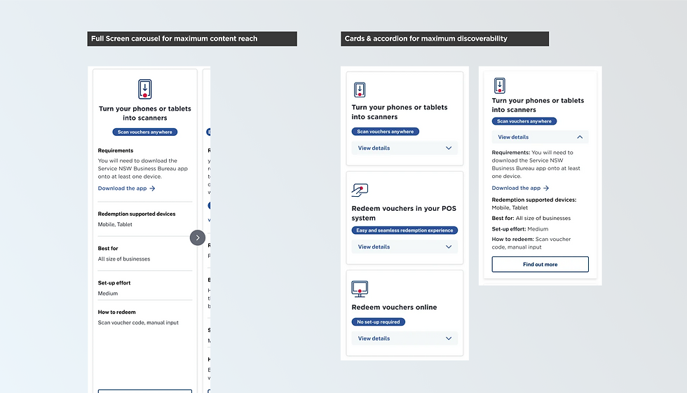
Experiment at Service NSW
Inaccurate data and impact
Do not rely on a single metric or a single method solely, always combine multiple metrics and a mix of qualitative and quantitive research methods to uncover a more accurate story.
Data tells a story but never a full story, mis-taps on arrows can skew user interaction data, leading to inaccurate conclusions about product performance. For example, frequent mis-taps on carousel arrows or lack of user engagement with the carousel due to poor accessibility might be misinterpreted as user interest. To address this hypothetically, I might look into correlated data points in both qualitative and quantitative data. This could include:
-
Click rates on the preview track button and Play playlist button, which can complement left and right arrow interactions as a metric of user interest.
-
The time spent on each card item—if it’s particularly short, it likely indicates that users are struggling to scroll up and down rather than truly engaging with and sampling the music.
-
User testing data to get qualitative feedback.
What the difference between Service NSW& Spotify designs?
Theres no one design fit all, the context matters! In Service NSW case, making all options available upfront and easy to read is more valuable than visual impact, and the card & accordion design delivered on these priorities. On the other hand, Spotify’s case focuses on creating an immersive and entertaining experience—a very different goal that demands a different solution.
When not to use carousel?
In contexts where users need to quickly access all options—such as filling out forms, accessing vital information, or comparing items—carousels can hinder usability. The hidden nature of carousel content can reduce discoverability and lead to frustration if users are unaware that more items exist.
How to improve Spotify's design?
Concept 1: Repositioning controls to enhance visibility and avoid mis-taps
Design Changes:
-
Relocated arrows to an extended space below the carousel, preventing accidental activation during vertical scrolling.
-
Positioned the "Play Playlist" button at the bottom, labelled clearly to distinguish it from the "Preview Track" button.

The screen recording shows me scrolling down the page, but only the carousel moves.
Findings
A. Couresel - High engagement on first item but limited discoverability for rest
This version did a great job showcasing multiple items within a compact space, and we observed that the first item consistently drew the highest engagement. Users rarely made it past the first item. This behaviour highlighted the critical need to prioritise content effectively.
B. Accordion card - High discoverability and scannability for all items
We compared a carousel layout with an accordion-style design that ensure the content wont overwhelm users while having more options. The accordion approach allowed users to see all options upfront and choose sections to read further if they found relevant. Interestingly, 4/5 participants preferred this approach. They appreciated how the accordion made information easier to digest and reduced cognitive load.
A/B Testing
Concept 2: Illusion of continuity to enhance usability and the immersive experience
Design Changes:
-
Use the illusion of continuity by showing a partial preview of the next card. This encourages intuitive swiping while eliminating the visual clutter, allowing the video content to shine. However, while using this type of cues, make sure you leave enough space on the left edge so they won't back to previous page or open a setting menu .
-
Place the "Play Playlist" button near the playlist title, clarifying its function logically and reducing cognitive load.

The screen recording shows me scrolling down the page, but only the carousel moves.